I’ve made a visualisation tool for digging into the English index of multiple deprivation (IMD). The 2019 IMD just came out, accompanied by a bunch of great ways to look at it, including Alasdair Rae’s full set of local authority maps and Rob Fry‘s amazing webmap that shows all IMD subdomains for any LSOA (lower layer super output area).
My own visualisation aims to tell some stories with the data by comparing different local authorities in England and looking at how the IMD has changed between 2015 and 2019, as well as allowing free exploration. It’s utterly unsuitable for phone screens, for which I make only mild apologies. I don’t think something like this would work in that format, though someone with better design skills may disagree. (I’d love to hear from you!)
This post won’t re-state everything the visualisation says – there are little data stories in the viz itself to step through and full instructions that hopefully make sense. Here, I want to go into a bit more depth about the data and code – caveats and such that wouldn’t fit in the mini-descriptions in the viz – as well as pulling out some of the most striking things it shows.
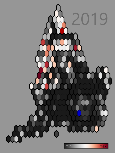
The viz uses Oli Hawkins’ amazing England hexmap of local authorities. The map below is the one I found most stark: percent of a local authority’s zones in the most deprived decile. Large swathes of England (the darkest grey) have no zones at all in the most deprived decile. The North has few places without zones in the most deprived decile. (There’s a strip that includes York, Harrogate and Craven that have none though.)
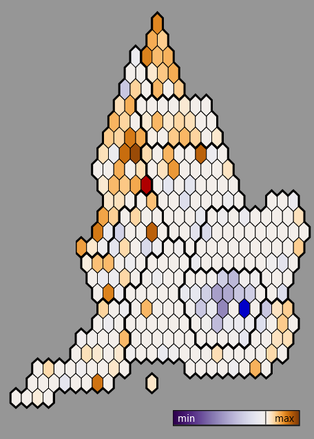
Even more stand-out perhaps is how the proportion in the most deprived decile changed between 2015 and 2019. Brown-orange (‘max’) shows places that gained zones in the most deprived decile, purple (‘min’) shows places that lost zones. Many of those same Northern local authorities who already had a lot of zones in the most deprived decile gained the most extra LSOAs in it. Note the caveat below – change can only be considered relative, not absolute. But it does show Northern places falling relatively backwards compared to England as a whole. Much of London goes the other way – many LSOAs previously in the lowest decile have moved out.
The map of percent of zones in the least deprived decile is interesting – I’ll let you go and explore that in the viz. In summary: many of the least deprived places west of London seem to have lost a lot of zones in their least deprived deciles between 2015 and 2019.
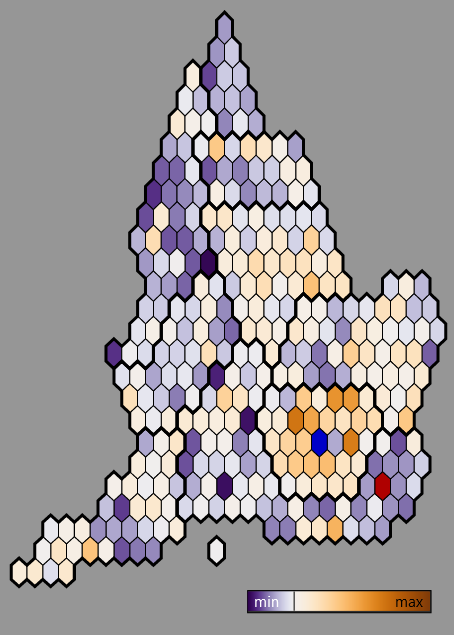
The map of 15-19 change for the local authority mean (below) doesn’t tell quite the same story as change in the most deprived decile. The South-east has many places with just as large drops as the North (though the North is more extreme). But it does tell the same London story: it has a cluster of the largest mean gains. There are many extremely deprived places in London – the viz has one story looking at Barking/Dagenham and Hackney – they have no zones in the least deprived four deciles. But London generally seems to have moved up the ranks, even if just a little in some of its more deprived local authorities.
Some things about the data. The viz only looks at the main index of multiple deprivation that combines the seven subdomains into a single score and then rank. Rob Fry’s visualisation does a beautiful job of showing how the subdomains differ within LSOAs. But writing data stories for each subdomain is maybe a job for another time…
As with the DLG report, the viz uses population weighted mean and median. That’s equivalent to finding the mean per person in a local authority rather than per zone. The weighted median is “the middle person” (though all people in one zone will have the same value). Mean/median per zone and weighted mean/median are closer to each other in places with larger populations – weighted is fairer to smaller places.
The viz uses the 326 local authority boundaries that were still correct at the time of the 2015 IMD. They’ve since changed and will continue to change up to 2021. Sticking with the older borders makes comparing 2015 to 2019 change straightforward and also lets me use Oli Hawkins’ hexmap. It is possible to compare to 2015 using the new boundaries: DLG have recast 2015 to 2019 local authority boundaries (see file 14 at the bottom of that page). I’m cool with 326 – it seems good to keep a few extra options given the viz is in part about comparing two local authorities side by side. I feel a bit like I’m breaking some kind of secret geographers’ code using out of date boundaries, though. So don’t tell anyone. (I’m doing the same using the old banished GOR boundaries to indicate regions too. Eurostat still uses them as NUTS1 level zones, mind.)
As I mentioned, be careful with 2015-19 comparisons. The official IMD report points out (in the section on ‘interpreting change over time’) differences between 2015 and 2019 can’t be treated as absolute change, only relative. It’s valid to compare how places have moved in the ranks relative to each other between timepoints, but not to conclude they moved up or down in absolute deprivation. As the report says, of any particular area:
It may be the case that all areas had improved, but that this area had improved more slowly than other areas and so been ‘overtaken’ by those other areas.
Lastly: all code and data is available here. There’s R for data prep and D3/javascript/HTML/CSS for the viz itself. A while back I had some absolutely brilliant D3 tuition from Peter Cook that helped me hit the ground running, especially for how to structure a javascript project like this.
Original data sources used are: IMD 2019 data at the open data communities link, IMD 2015 data, local authority and LSOA geographical border data (both OGL) from the UK Data Service’s borders site.
Feedback or comments on any aspect of the viz most gratefully received. (Twitter or email dan olner at gmail dot com.)