Video above: how house price substitutability changes between Glasgow postcodes. The blue dot (centre, below the river) moves up and down across a few postcodes. Large red dots show other postcodes where house prices have moved in tandem over time. As the dots shrink / turn green, price movement matches become weaker. Right-click on the video to get a ‘loop’ option to see the pattern better.
—
One of the lovely things about my work in the Sheffield Methods Institute over the past few years has been the huge diversity of projects I’ve got to work on, often collaborating on things I’d never otherwise have ended up doing. I’d like to start writing about some of those here, particularly those that may otherwise not get much daylight.
For this one, I produced a visualisation of a unique kind of housing data. The idea for this data is Gwilym Pryce‘s; the data production itself was done by Nema Dean. This went into their paper: ‘is the housing market blind to religion?’
I’d like to use this as an excuse to mull about visualisation generally (carrying on some of the ideas from e.g. ‘what’s the difference between a box-plot and an x-ray’). This example is all about the importance of interaction for finding otherwise hidden patterns in data. More on that shortly.
The concept from that paper I visualised was Gwilym’s ‘cross-price elasticity of price’ (CPEP) between postcodes in Glasgow. This is a way to measure how closely substitutable properties are – for example, if a buyer doesn’t mind which of two houses they end up buying, they are perfectly substitutable. Gwilym and Nema measure this by comparing how house prices move in a given chunk of time – if they move in tandem, they’re highly substitutable.
This is the dynamic the measure aims to capture: if demand for certain properties goes up in one location, their prices will rise. This will then push buyers to look elsewhere for similar properties that perhaps haven’t risen in price as much. That will then increase those prices… and so on. The effect is that prices will move closely (with a slight time delay) if the market is identifying them as closely substitutable.
They’ve done this for every postcode pair in Glasgow, for every quarter between 1999 and 2007, regressing a log of the time series between them (and making various adjustments; see the paper p.8). This gives every one of Glasgow’s ten thousand postcodes a CPEP value connecting it to every other postcode in Glasgow.
This is actually pretty awesome – as the paper points out, the idea that house price dynamics might be connected across very different regions of space is not obvious. One can easily imagine neighbouring properties moving in tandem, but what would substitutability look like across an entire city?
This is where the visualisation comes in (coded using Java plus the Processing library. ). It starts with a map of Glasgow – when you hover the cursor over a postcode, it shows CPEP values for all other postcodes: large red dots indicate postcodes where prices moved in tandem with the one being hovered over. Dots become smaller and fade to a transparent green as price movements match less. The video above shows a small sample of doing this, for a single line of postcodes in the centre, just below the river (the moving blue dot).
And what do we see? To my eyes, there are two fascinating things going on. First – there are substitutability waves across space. This is stronger in some places than others – but when present, it’s striking. As the cursor is moved across postcodes, substitutability patterns flow smoothly. This doesn’t just happen in one location – several will be linked, showing the same wave-like pattern.
Which means what? Well, I’m not sure. Some wild speculation: this is showing us that housing markets (or at least Glasgow’s) have a very fine-grained spatial structure. The spatial network that binds quite different locations together is really very strong. It is also re-iterating that distance matters: we get contiguous bands moving together. But those bands shift in ways closely tied to other, very different, parts of the city – which is what we’d expect if it’s capturing the effect of very different areas being close substitutes.
Or… and this is a hangover from PhD days where initial impressions weren’t always right… there’s something else going on we don’t understand, and the data is capturing that. It could be something about how the method processes the prices. Without digging deeper, I’d be wary making any firm statements.
Loop the video (right-click to get loop option) and watch it on repeat with that single blue point moving back and forth. You’re seeing something based on theory, data and visualisation that other kinds of modelling won’t tell you. It’s relying on your brain’s ability to spot that pattern – you can see the wave that moves across space. That’s the great thing about visualisations like this: they point you in a direction, they ask questions, they pose problems – they reveal hidden things.
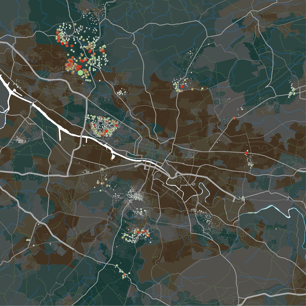
The second stark result, pictured below in gif form: the Forth and Clyde canal in the North-West separates two housing areas. Note the map’s background colours – darker brown zones are more deprived, darker greens are less deprived. The gif shows the light green cursor moving across the north (Bearsden, quite wealthy) and south (Temple, quite deprived) side of that canal.
We see – apparently – two entirely separate housing markets each side of the canal. Bearsden shows substitutability with the also-quite-rich-but-also-quite-studenty Partick, as well as a few tiny areas elsewhere. But hardly anywhere else in the city – it appears to be a quite self-contained sub-market. Only a few metres away across the boundary of the canal, it’s a completely different market – much more broadly connected, and not restricted to richer or poorer areas, it seems.
That is so striking, I wonder if it isn’t something to do with estate agents. But again – we get to see something about housing sub-markets that would otherwise have been difficult to find without wandering a cursor about the data.
Some further random visualisation thoughts this throws up.
Computationally, it needs to be fast. Ten thousand paired postcodes is a matrix with a hundred million datapoints. A single ten-thousand value column needs to be loaded every time the cursor changes postcode. So for a project like this, you need to use something like Java / Processing. (Actually, this may make it challenging to scale up to something like London – the data needs loading entirely into memory to be displayed quickly enough. London might need a different approach.)
Without this interactive speed, those patterns may well be inaccessible to the human eye. I get the impression this goes against the grain of where visualisation is at these days – including, for example, objections to “too busy” viz. The x-ray blog post above talks about this a bit more – but in short, I think that’s missing a huge chunk of why visualisation is important for thinking about data/systems. Often, we can benefit from the kind of “busy” viz that we will then spend far too long staring at, while our natural pattern-spotting skills search for meaning. You wouldn’t necessarily want to use that same visualisation for communicating findings – but that’s OK, that’s not its purpose.
I could be wrong about that, in two ways: perhaps you don’t think these patterns matter. Or, perhaps there are better, less fluffy ways to find them. Possibly – but that brings us back to x-rays again. I’m arguing against reducing complexity, seeking out single sets of metrics – for certain purposes.
We use simpler metric for understandable reasons, like being able to ask “objectively, has y gone up or down over time?” But it’s easy to see – when thinking about x-rays, where the complexity, subtlety and learned vision of the radiographer is so vital – why this reductionism doesn’t always apply and can actually be damaging. Sometimes, it’s best to build things that rely on our own pattern-spotting abilities, rather than (as with statistical approaches) assume those are liable to lead us astray.
Work done for the Urban Big Data Centre, ESRC Grant Reference: ES/L011921/1